Wanderly
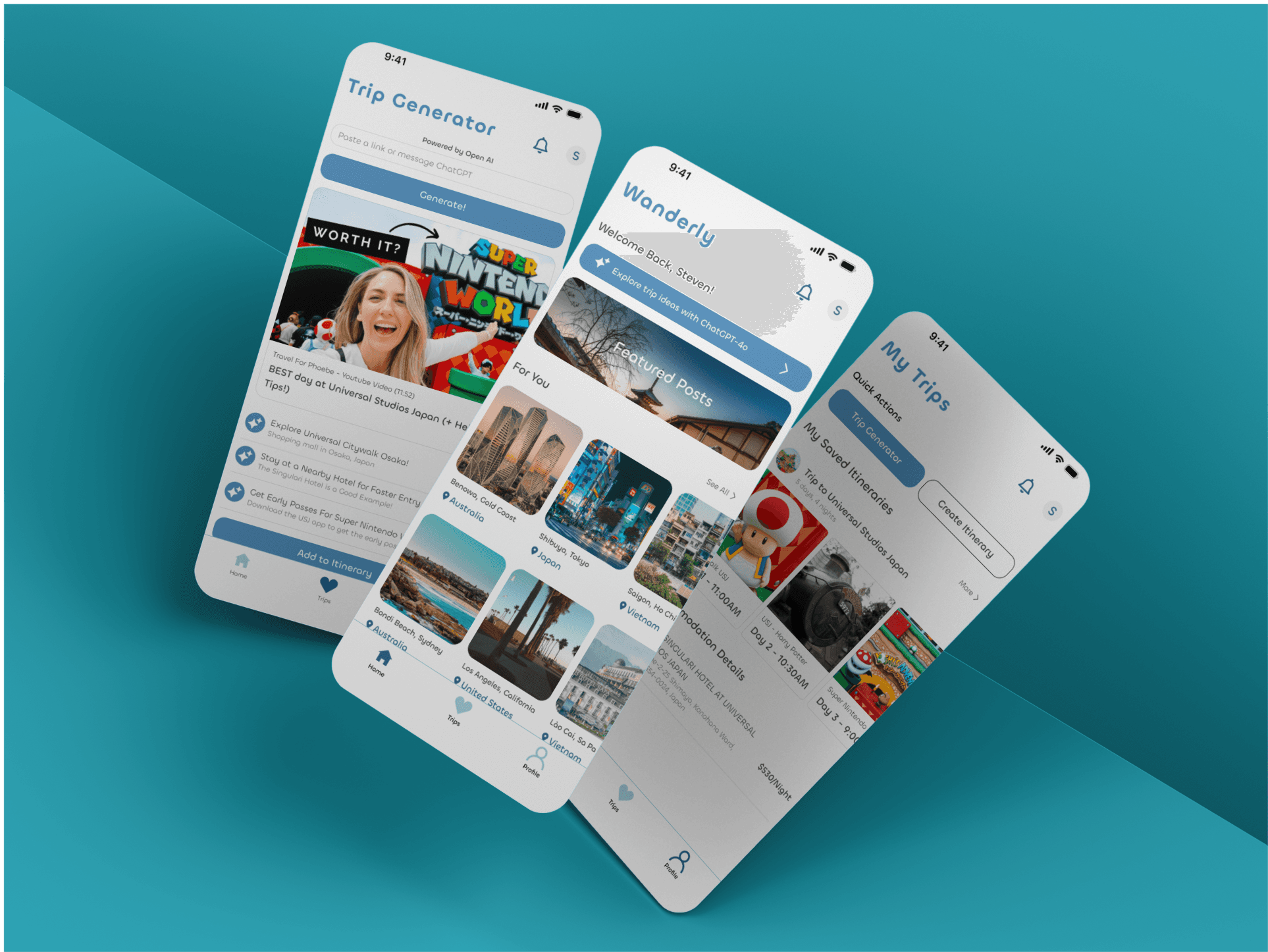
Wander.ly is a digital holiday planning app designed to simplify travel planning for post-COVID-19 travelers. Wander.ly offers a centralized platform that uses machine learning and AI to personalize holiday plans. This allows users to curate and share itineraries within the community, providing a streamlined travel experience without the need for external aid or commercial assistance.
Overview
Deliverable: Responsive Single-Page Web Application
Time Frame: 12 weeks (Mar-Jun, 2024)
Marks: This project received a High Distinction from the University of Sydney
Background Research
The research focused on understanding the travel habits and planning challenges faced by individuals aged 18-45, considering how technology, lifestyle, and economic factors influence their approach to travel planning.
Through examining existing studies and conducting original research, I discovered that many travellers, especially younger adults, often face difficulties in organising multi-destination trips, managing bookings, and ensuring they make the most out of their travel experiences. These challenges can result in poorly planned trips and missed opportunities, emphasising the need for a more intuitive and comprehensive travel planning tool.
Design Focus
Based on the research findings, I formulated a problem statement and proposed a solution:
Problem Statement
Travel planning, especially for trips involving multiple destinations, can be a complex and overwhelming process. The lack of cohesive tools to manage all aspects of a trip leads to disorganised plans, missed activities, and increased stress for travellers.
Solution
A travel planning application that enables users to seamlessly organise multi-destination trips, integrating accommodation, activities, and itinerary management into one intuitive platform.
Discovery Surveys
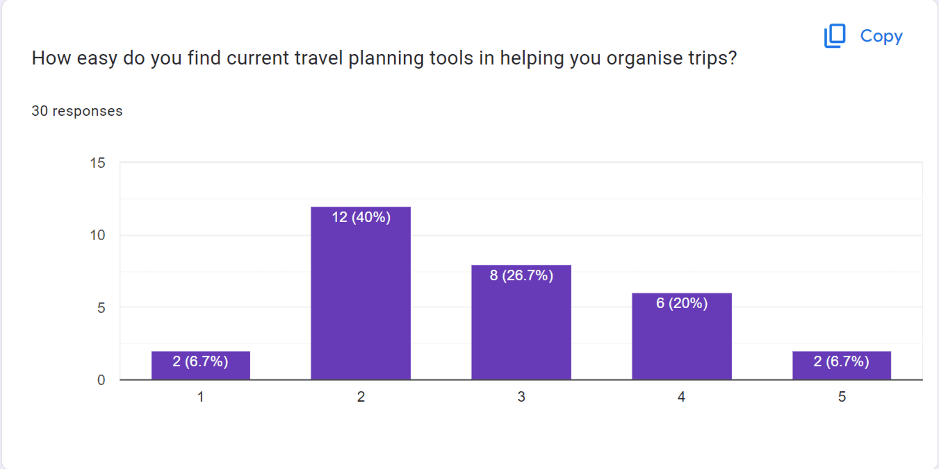
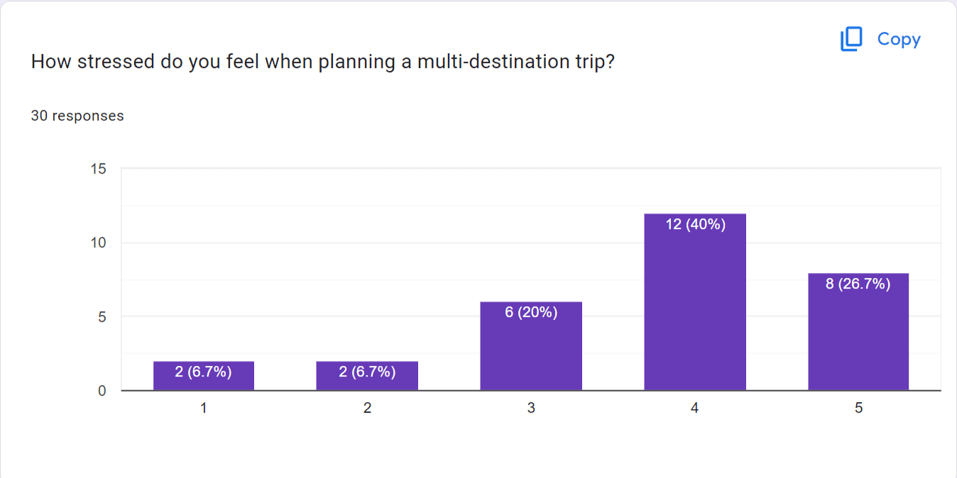
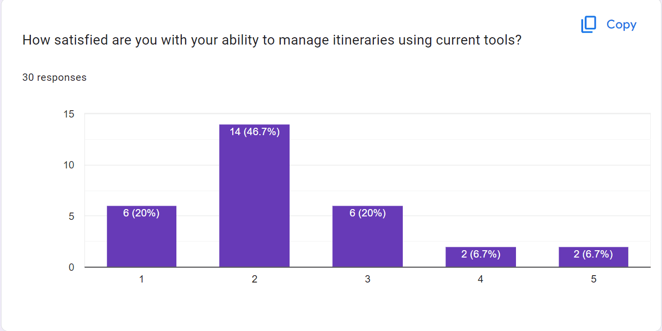
To gather insights, I conducted discovery surveys with 30 individuals who frequently travel or have a strong interest in travel.
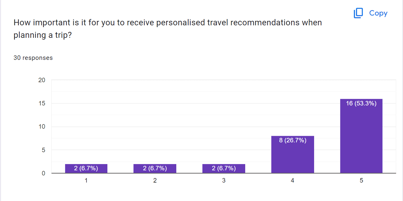
The survey revealed that 40% of respondents find it challenging to organise trips with multiple destinations and activities, and 53% expressed the importance of receiving personalised travel recommendations when planning a trip.
Interviews
I conducted 4 semi-structured interviews with survey respondents to gain deeper insights into their travel planning behaviours and pain points. The interviews highlighted the following key issues:
Difficulty in Managing Multiple Destinations:
All interviewees struggled to efficiently organise trips involving more than one destination, often missing out on experiences due to poor planning.
Challenges in Booking Coordination:
Three out of four interviewees found it difficult to keep track of different bookings, leading to confusion and, in some cases, missed reservations.
Overwhelm from Information Overload:
Interviewees expressed feeling overwhelmed by the vast amount of information available online, making it hard to decide what to include in their itineraries.
Overwhelm from Information Overload:
Interviewees expressed feeling overwhelmed by the vast amount of information available online, making it hard to decide what to include in their itineraries.
Wireframes
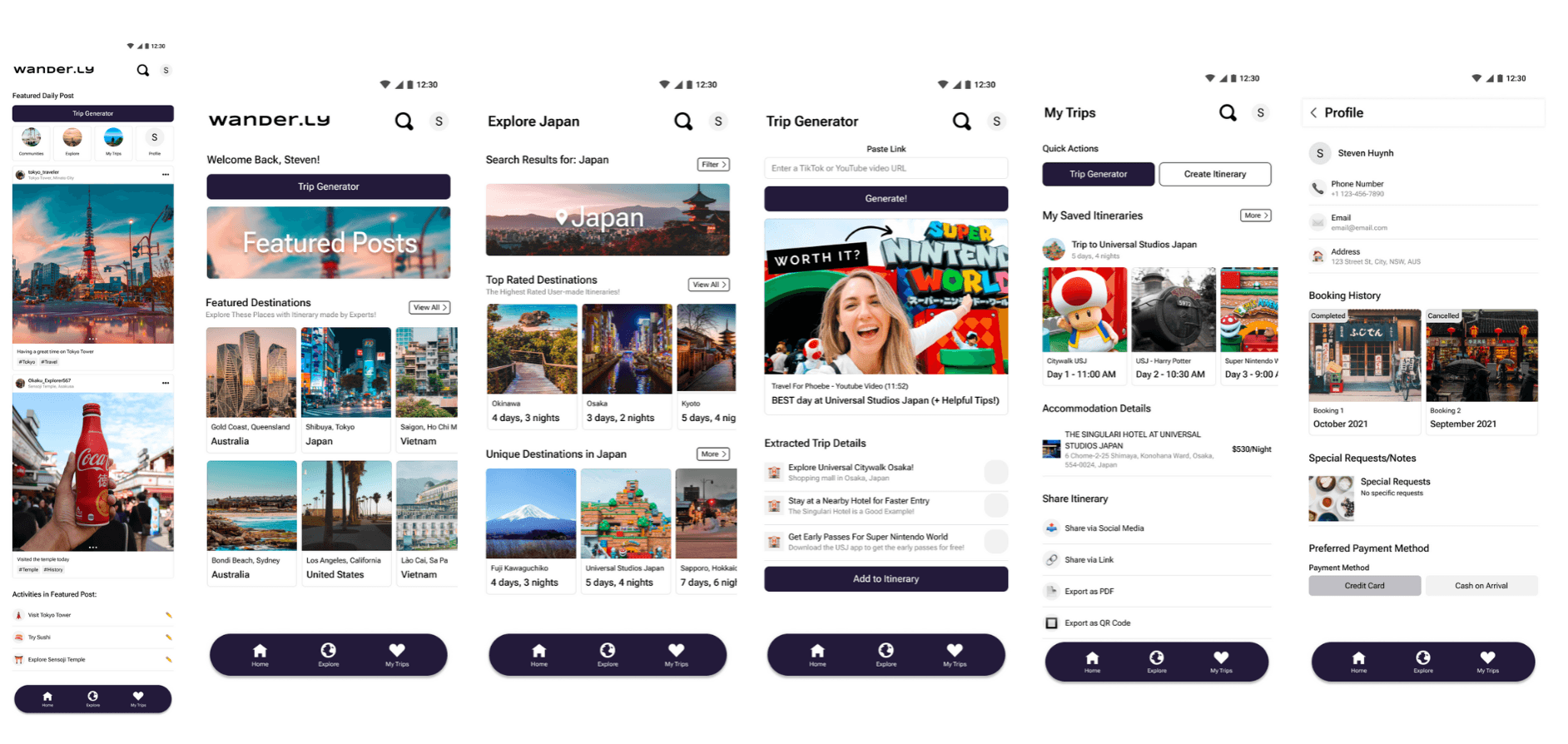
To address these pain points, I developed low-fidelity wireframes for key screens such as the trip overview, destination management, booking coordination, and itinerary planner. These screens served as the foundation for creating user flows and establishing the overall information architecture.
User Flows
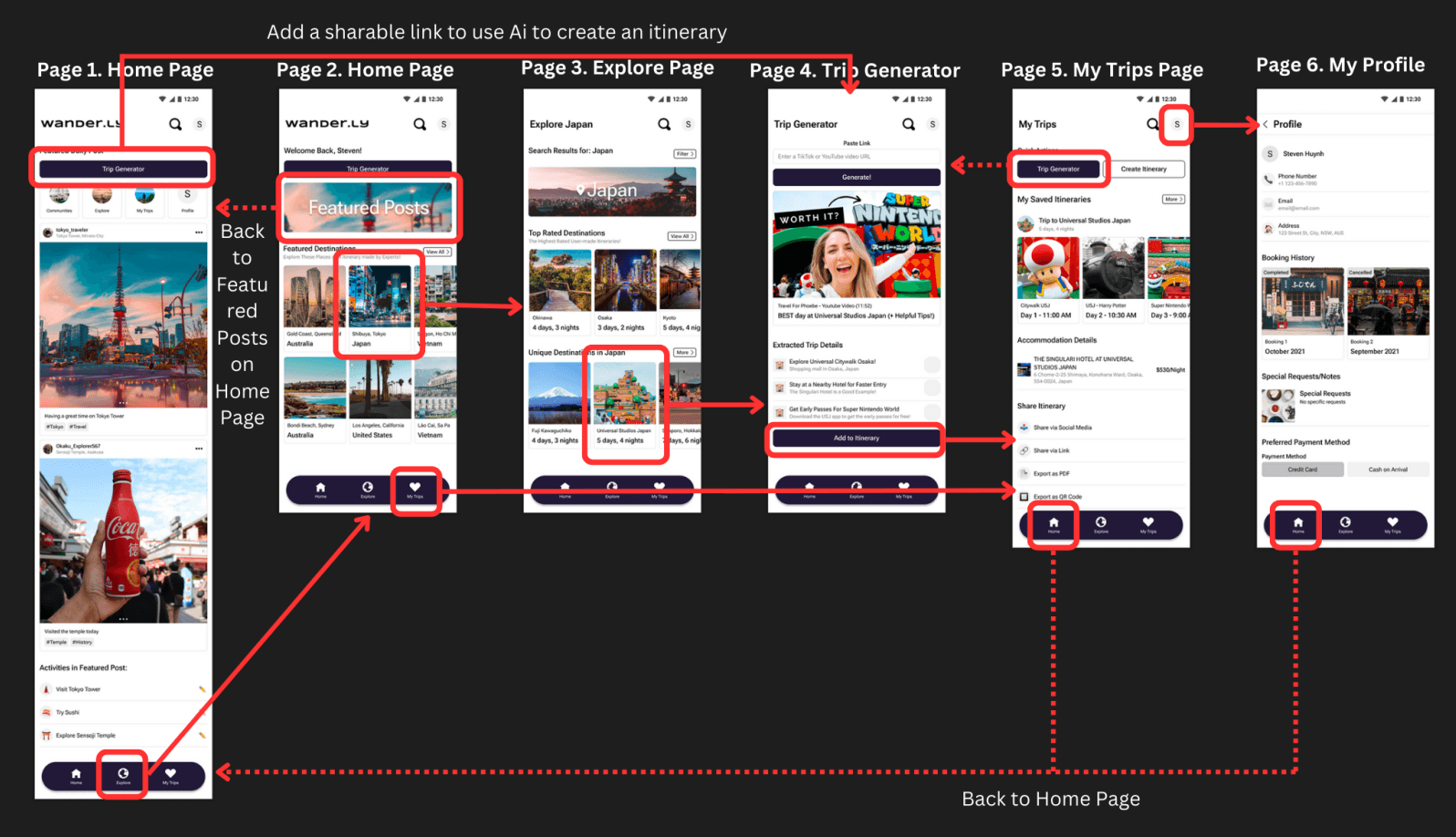
Following feedback from peer reviews, I expanded the project by designing additional screens to accommodate various user interactions and scenarios. This allowed for a more comprehensive and interactive prototype, simulating real-world use cases.
Usability Evaluation
Research Questions
Are there any points in the flow where users encounter obstacles or confusion?
How do users perceive the ease of use of the application?
Are there any functionalities that users feel are missing or could be improved?
What are the critical breakpoints or impediments within the application's usage?
Participant Criteria
Experience with travel planning, especially for trips with multiple destinations.
Basic technological literacy, including familiarity with mobile applications.
A diverse demographic, including at least one male and one female, aged between 18 and 45.
Willingness to participate in a recorded user test.
Methodology I conducted unmoderated usability tests with participants located across various regions. The sessions were conducted remotely, and each participant was given 30 minutes to complete assigned tasks while verbalising their thoughts using the think-aloud protocol.
Evaluation Results
The usability tests revealed three primary pain points that affected the user experience. I implemented the following changes to address these issues:
Enhanced Booking Coordination
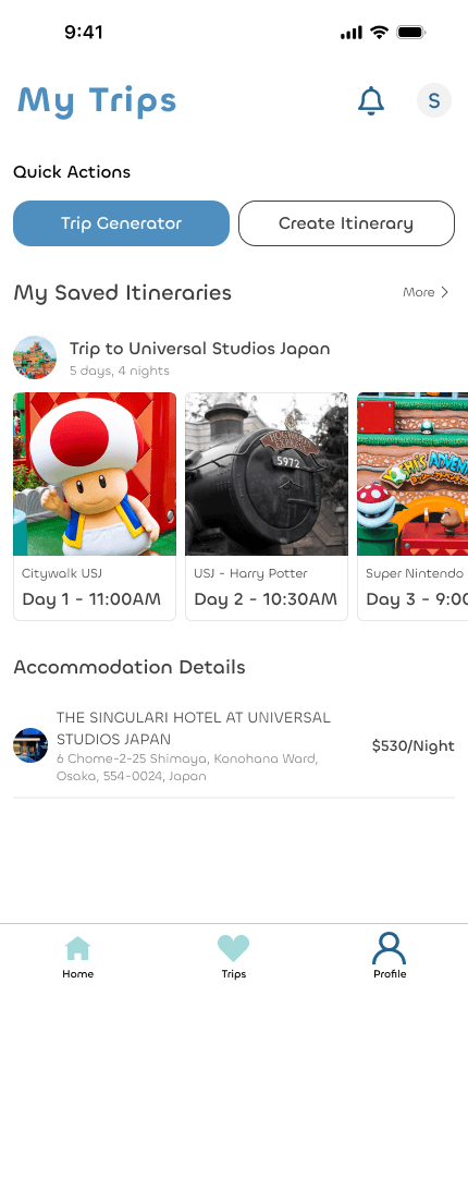
The initial design lacked a clear system for managing multiple bookings. I introduced a centralised booking management screen, allowing users to view and modify all reservations in one place, reducing confusion and enhancing trip organisation.
Streamlined Itinerary Planning
Users found the itinerary planning process cumbersome and time-consuming. I redesigned the itinerary screen to include drag-and-drop functionality, enabling quicker and easier planning of activities and destinations.
Improved Information Hierarchy
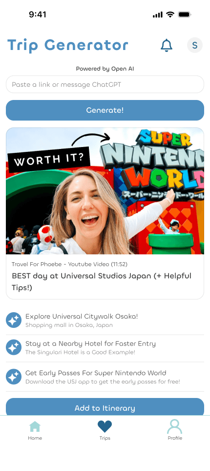
Feedback indicated that users struggled with the amount of information presented on each screen. I reorganised the information architecture, prioritising essential details and simplifying the user interface to prevent overwhelm.
Final High-Fidelity Prototypes
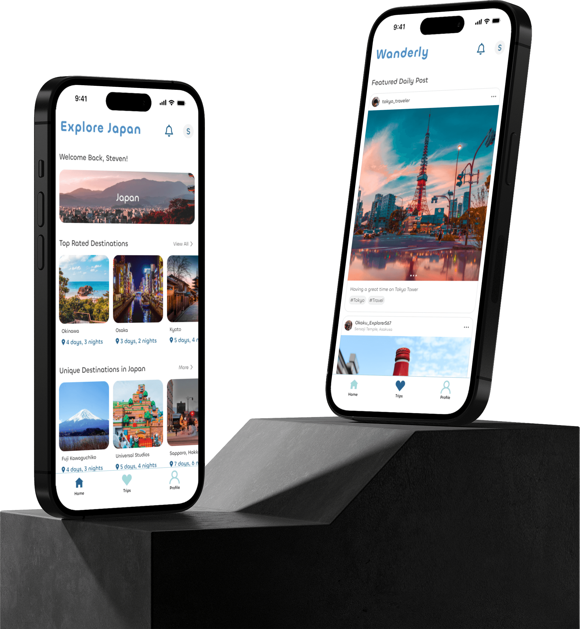
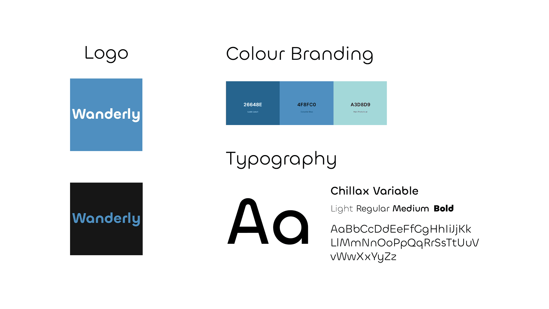
After refining the visual style and ensuring alignment with the brand identity, I developed the final high-fidelity prototypes. These prototypes were designed to offer a seamless and intuitive user experience, addressing the pain points identified during the usability testing phase.
Key Takeaways
This case study highlighted the importance of continuous user feedback and iterative design. Early-stage testing and peer reviews were invaluable in identifying potential issues and ensuring that the final product met user needs. The insights gained from usability testing were crucial in refining the design and improving the overall user experience.
Next Steps
To further develop Wander.ly, I plan to conduct additional usability testing on the high-fidelity prototypes to validate the effectiveness of the latest design changes. Following validation, I will create a comprehensive site map and design guide to assist developers in bringing the application to life.
