Di Trip Planner
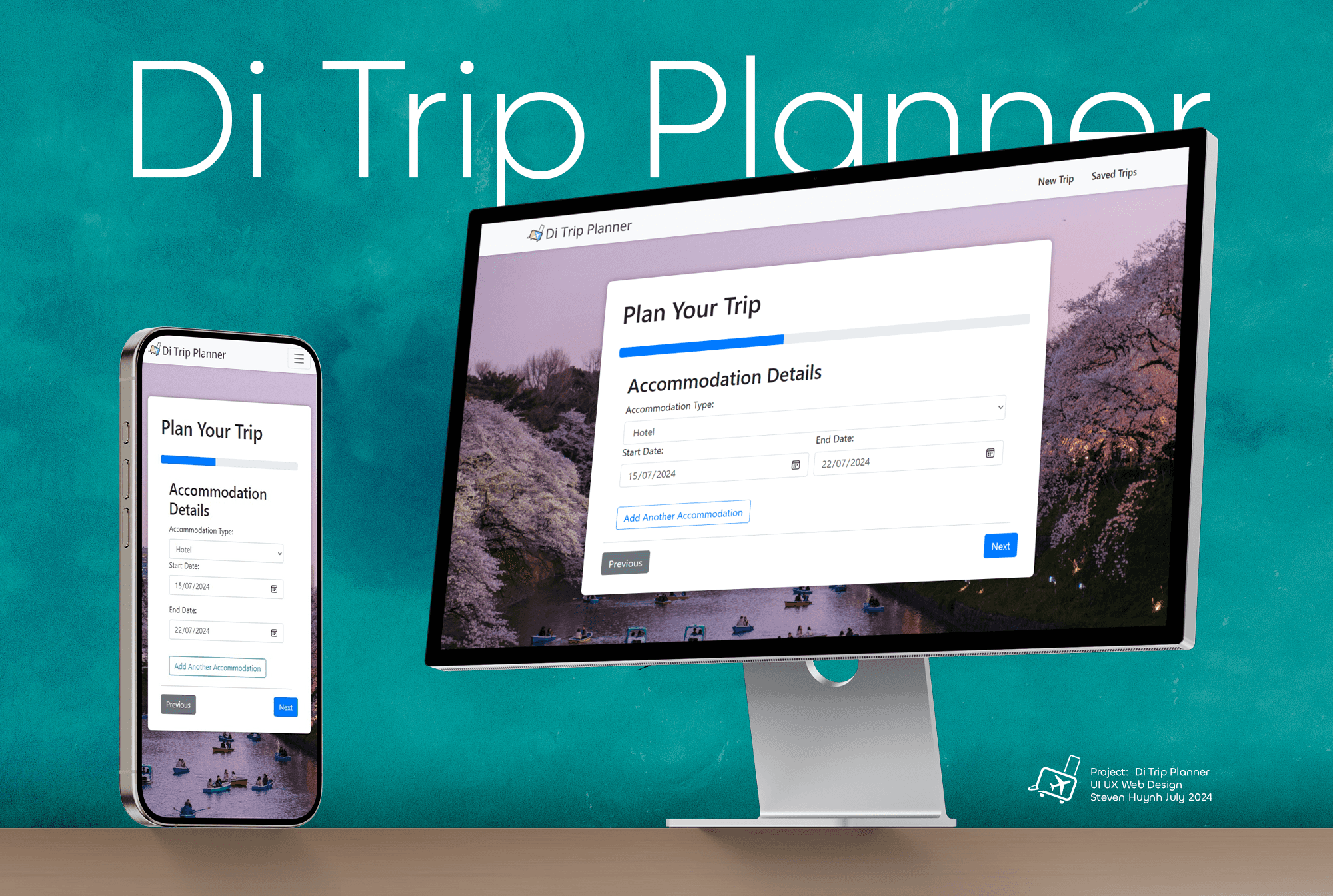
Di Trip Planner is a single-page architecture web application designed to help users plan and manage their holiday trips efficiently and in a structured manner.
Overview
Deliverable: Responsive Single-Page Web Application
Time Frame: 12 weeks (Mar-Jun, 2024)
Marks: This project received a High Distinction from the University of Sydney
Background Research
Context
As the international tourism industry has rebounded post COVID-19 pandemic, there has been a massive surge in tourism worldwide. According to Nguyen, the global demand for Japan's inbound tourism has boomed post-COVID-19, effectively revitalizing their tourism industry (Nguyen, 2020).
Purpose
There has been a lack of development in personal trip planning applications due to private commercialization and the increased popularity of pre-planned group tour packages. Additionally, existing holiday trackers often serve as singular tools to track only one aspect of travel.
Goal
To address this need, I aim to create a 'Vacation Planning and Tracker' application centered around planning personalized holidays."
Target Audience
The target audience is centered around first time travellers who seek a more independant yet comprehesive and personalised trip planning tool than what is currently widely avaliable on the market.
Video Walkthrough
Information Architecture
Result
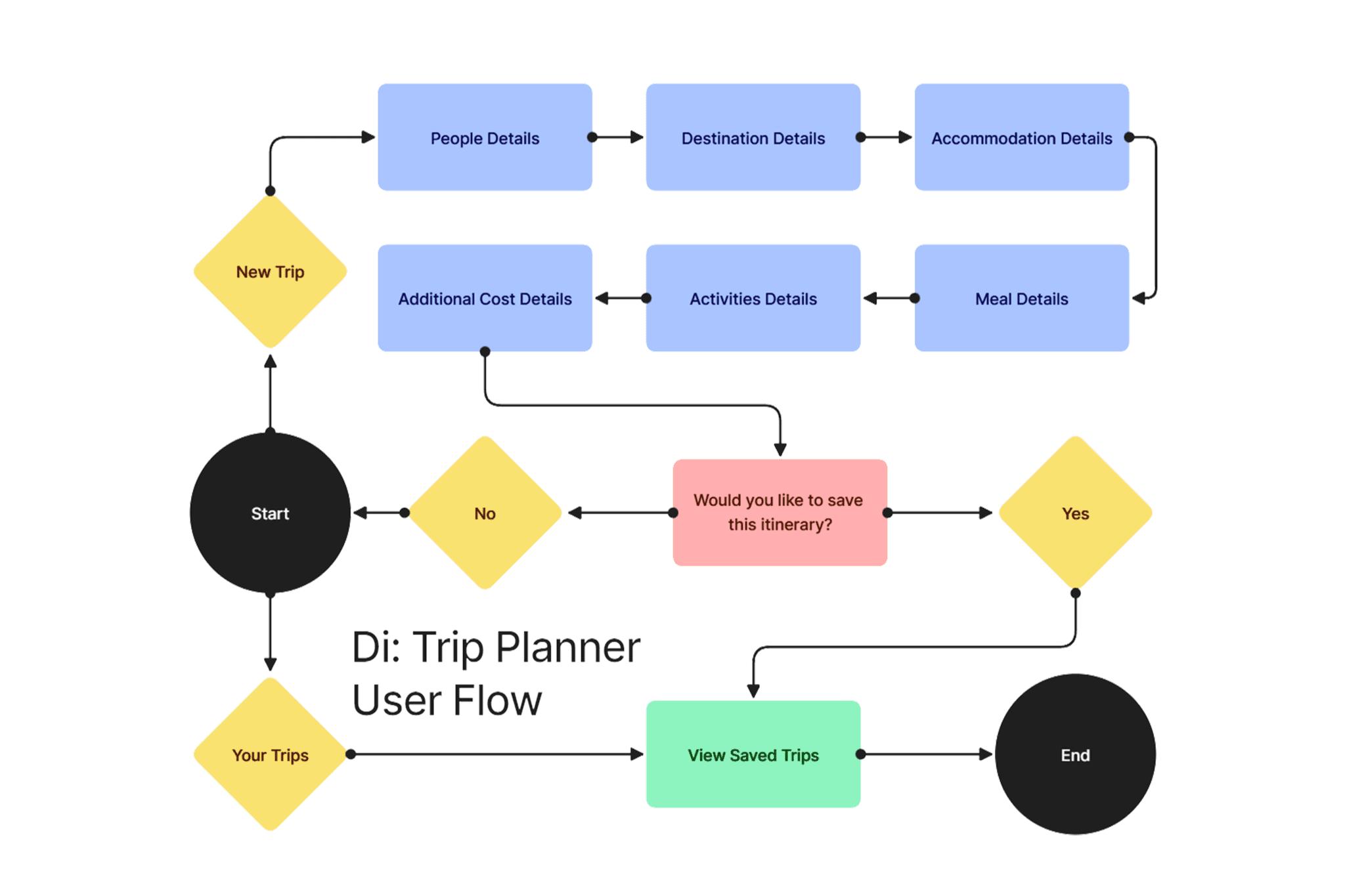
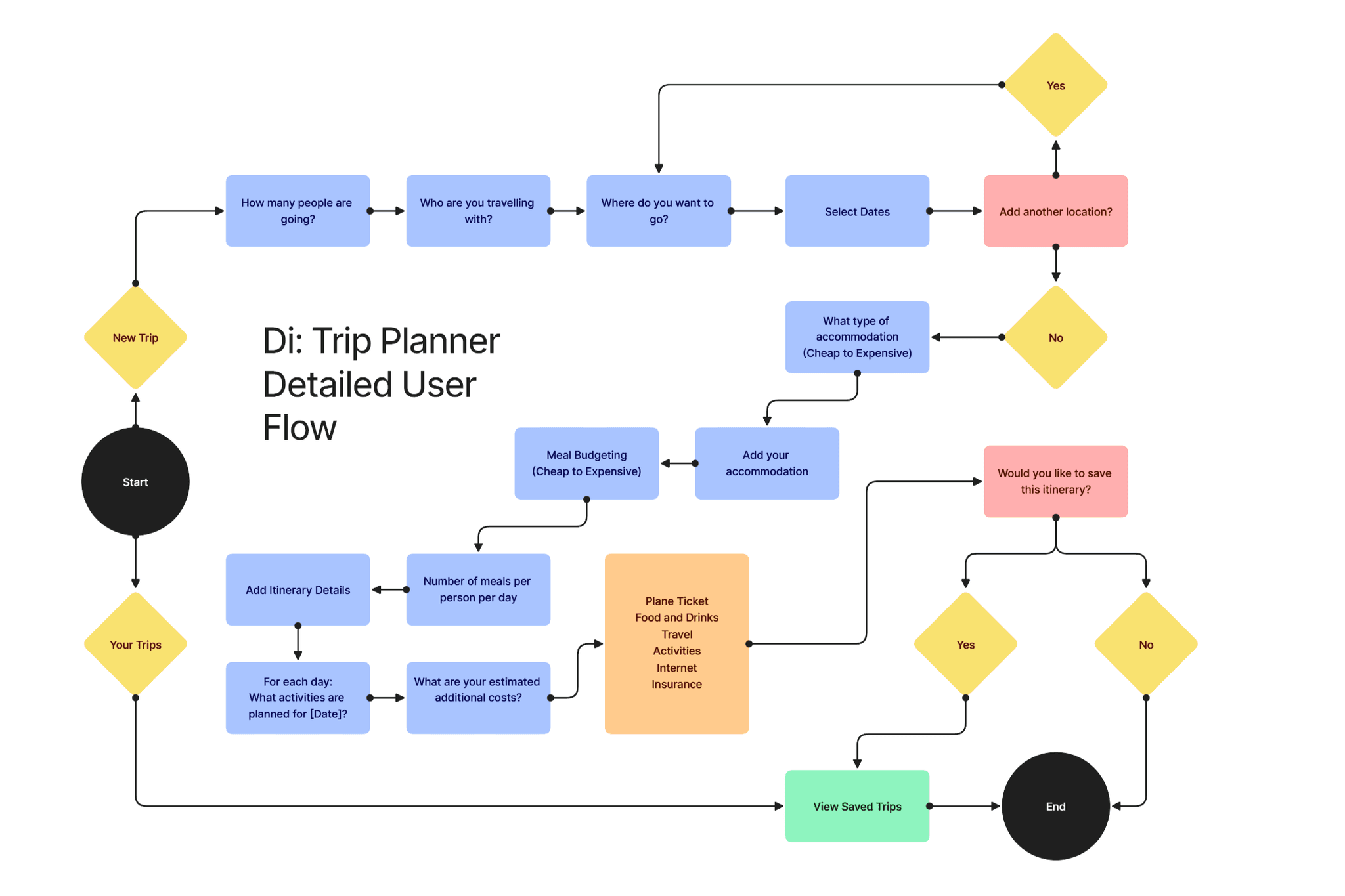
The primary purpose of this user flow is to guide users through a holistic trip planning process, beginning with determining the number of travelers and culminating in detailed itinerary creation for ease of access. By breaking down the sequence into smaller steps, the flow allows users to input important details without feeling overwhelmed. Each step of the user flow is designed meticulously to account for various aspects of travel planning, from selecting dates and destinations to budgeting for meals and accommodations. This structured approach enables the application to provide accurate cost estimations and serves as a user-friendly platform for easy data entry and tracking.
The primary purpose of this user flow is to guide users through a holistic trip planning process, beginning with determining the number of travelers and culminating in detailed itinerary creation for ease of access. By breaking down the sequence into smaller steps, the flow allows users to input important details without feeling overwhelmed.
Each step of the user flow is designed meticulously to account for various aspects of travel planning, from selecting dates and destinations to budgeting for meals and accommodations. This structured approach enables the application to provide accurate cost estimations and serves as a user-friendly platform for easy data entry and tracking.
Data Model Table
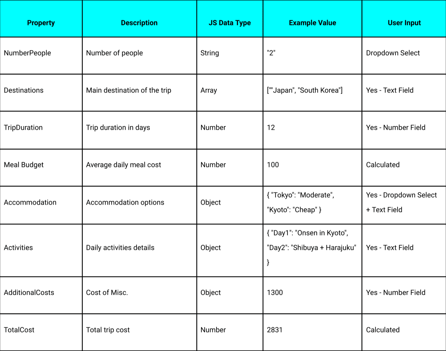
Similarly to the user flow, the data model is constructed to capture all the budgetary requirements for effectively planning a trip. This ranges from the trip duration to specific costs of meals and activities budgeting. Similarly to the user flow, the data model is constructed to capture all the budgetary requirements for effectively planning a trip. This ranges from the trip duration to specific costs of meals and activities budgeting.
Wireframe Sketches
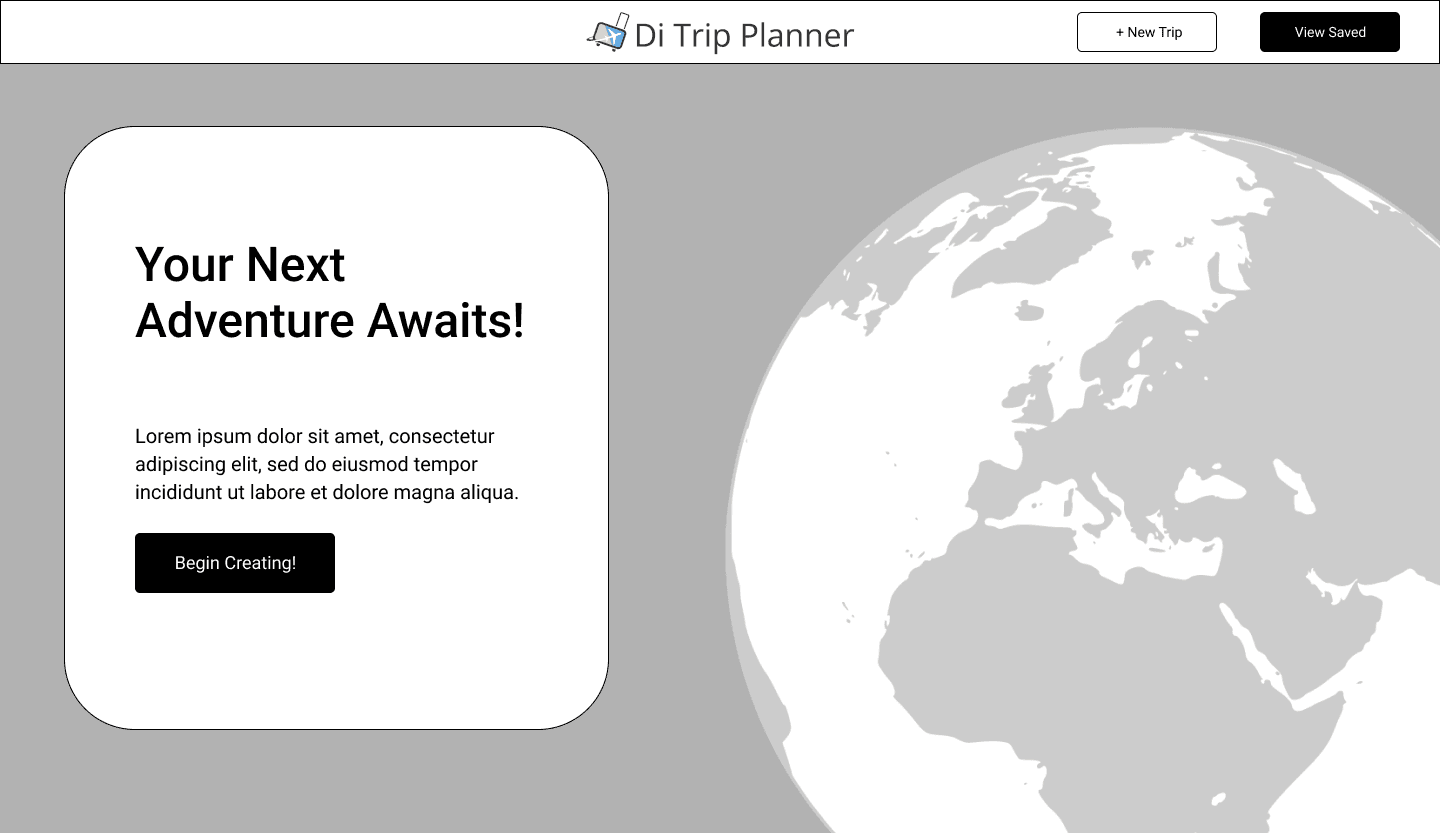
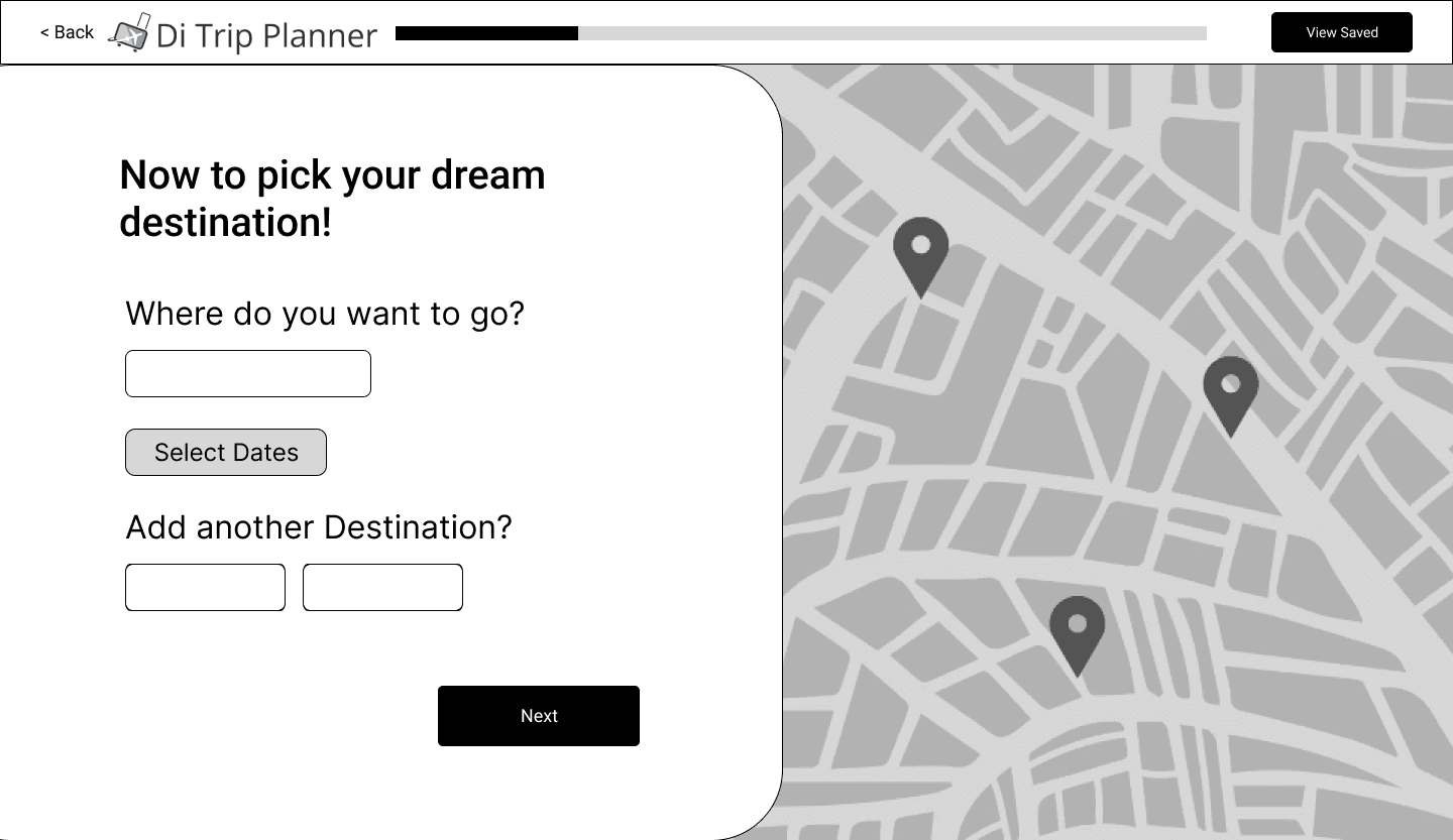
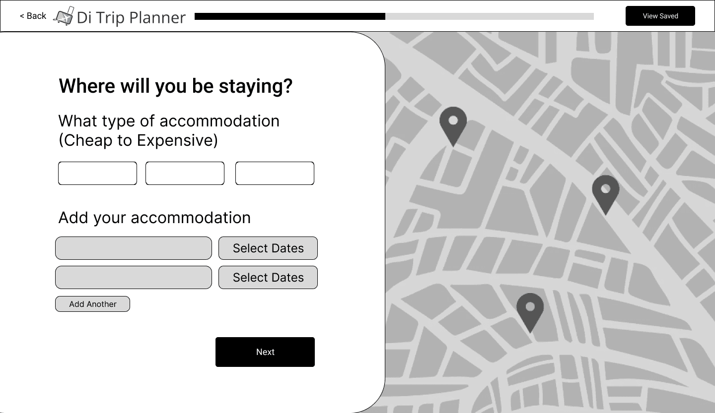
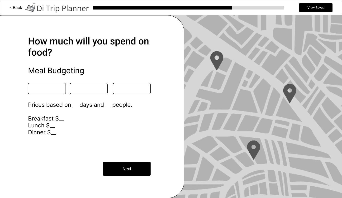
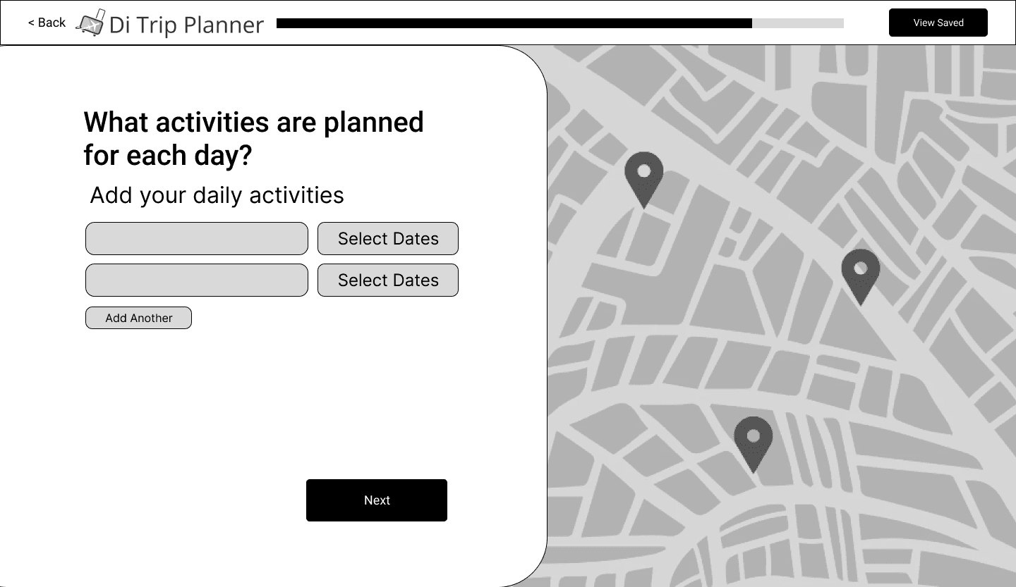
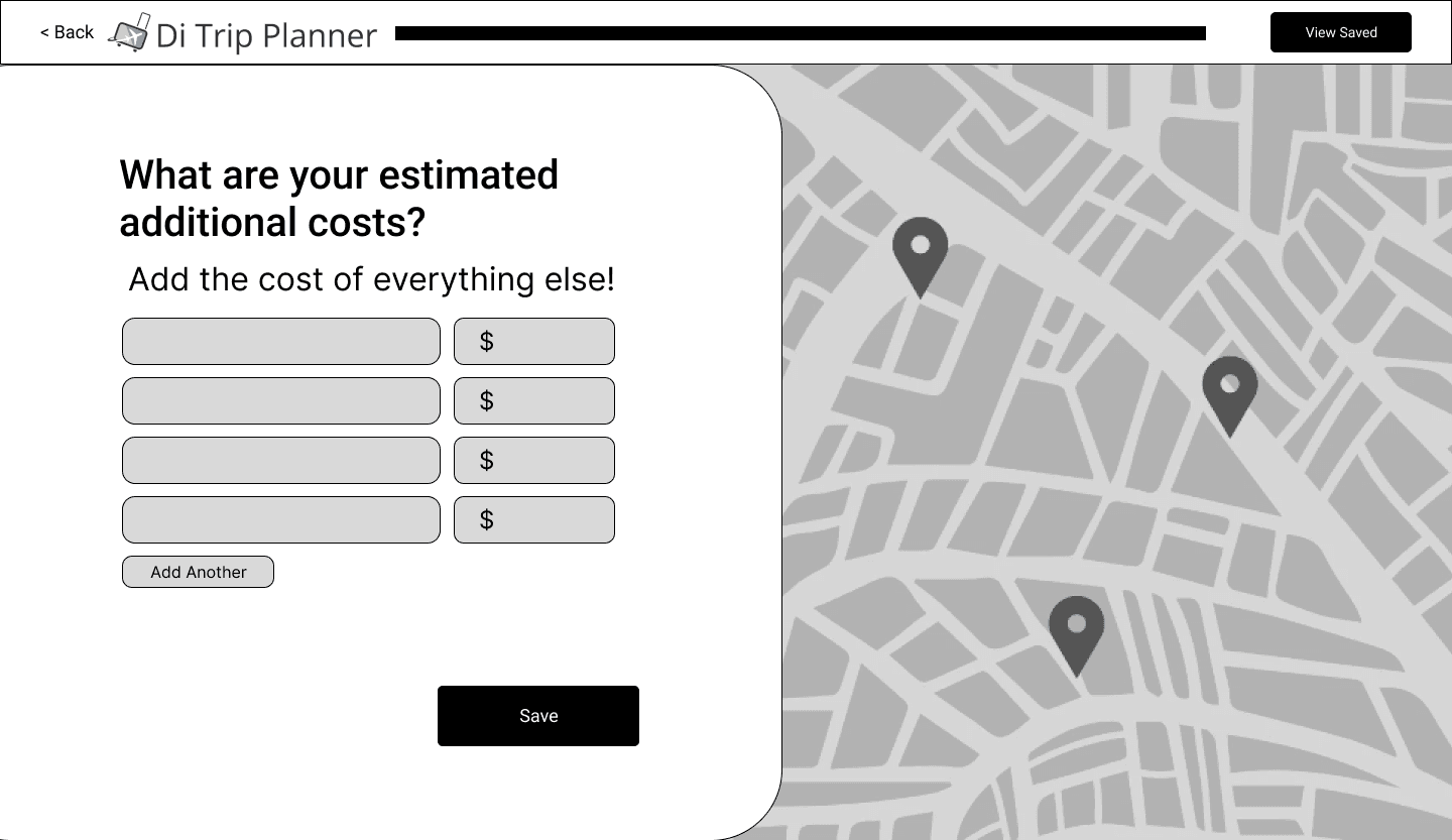
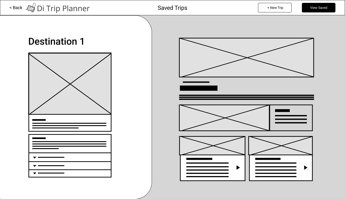
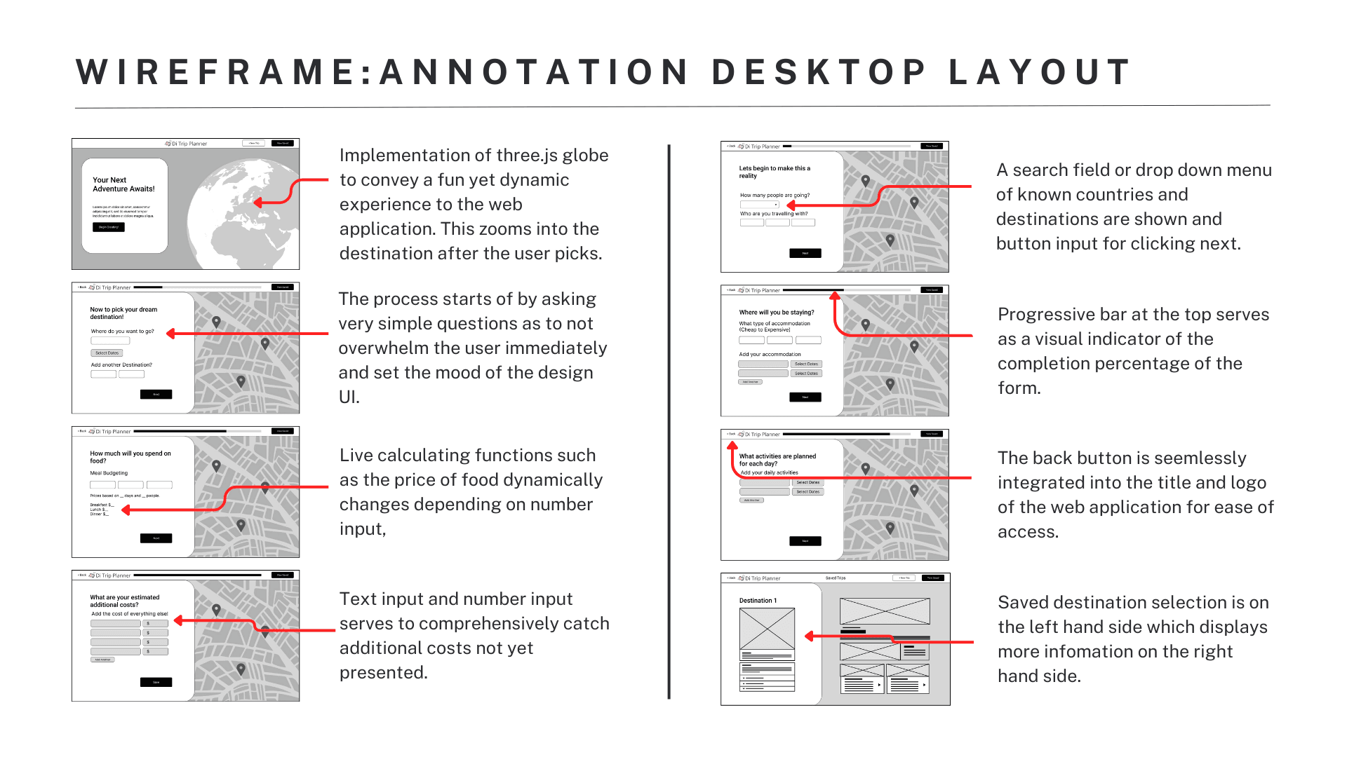
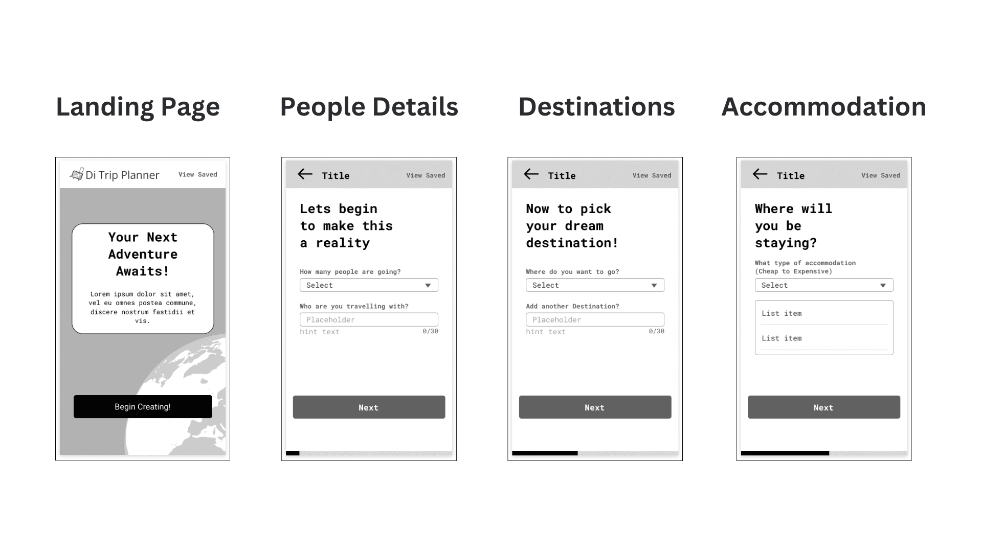
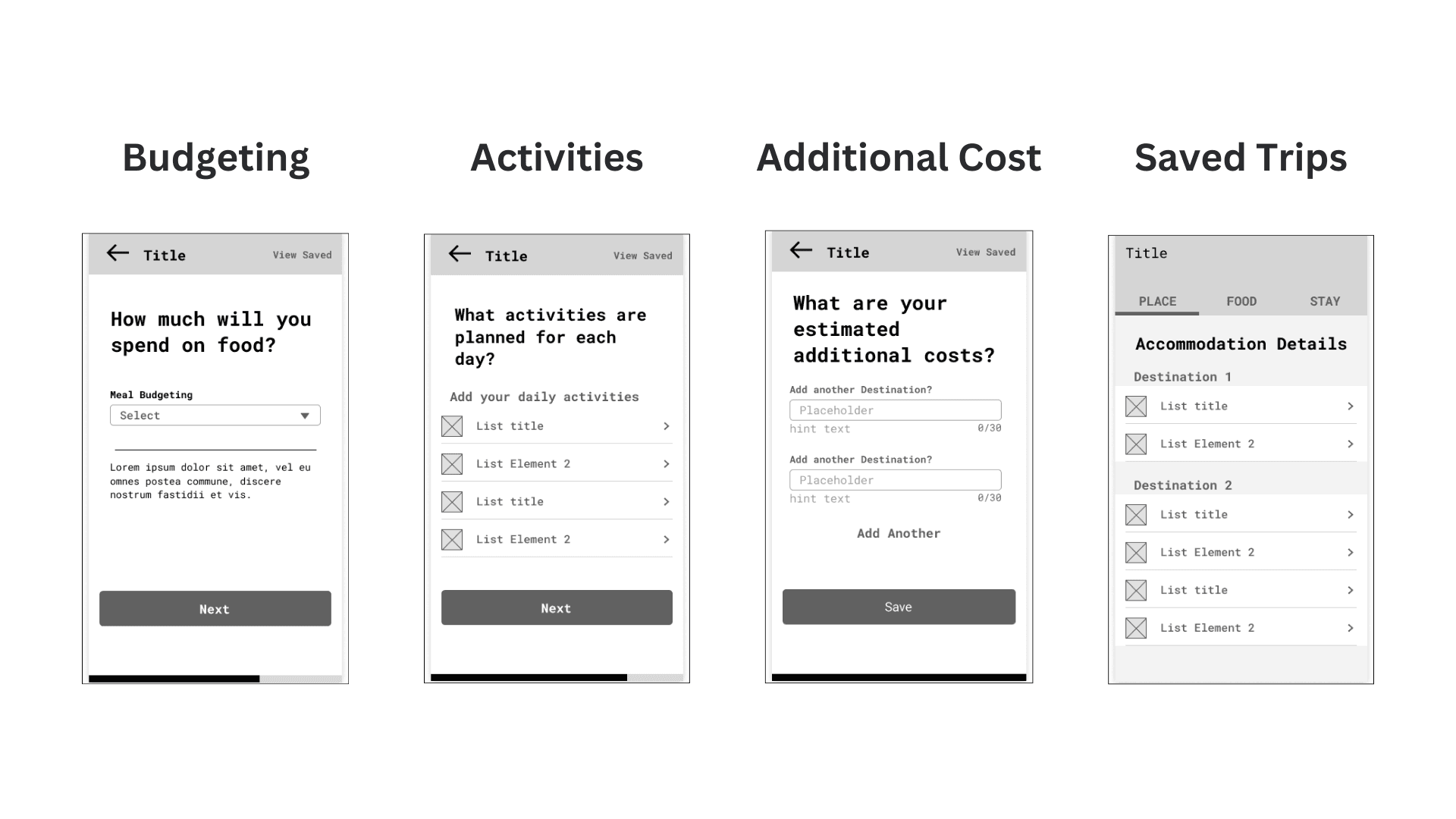
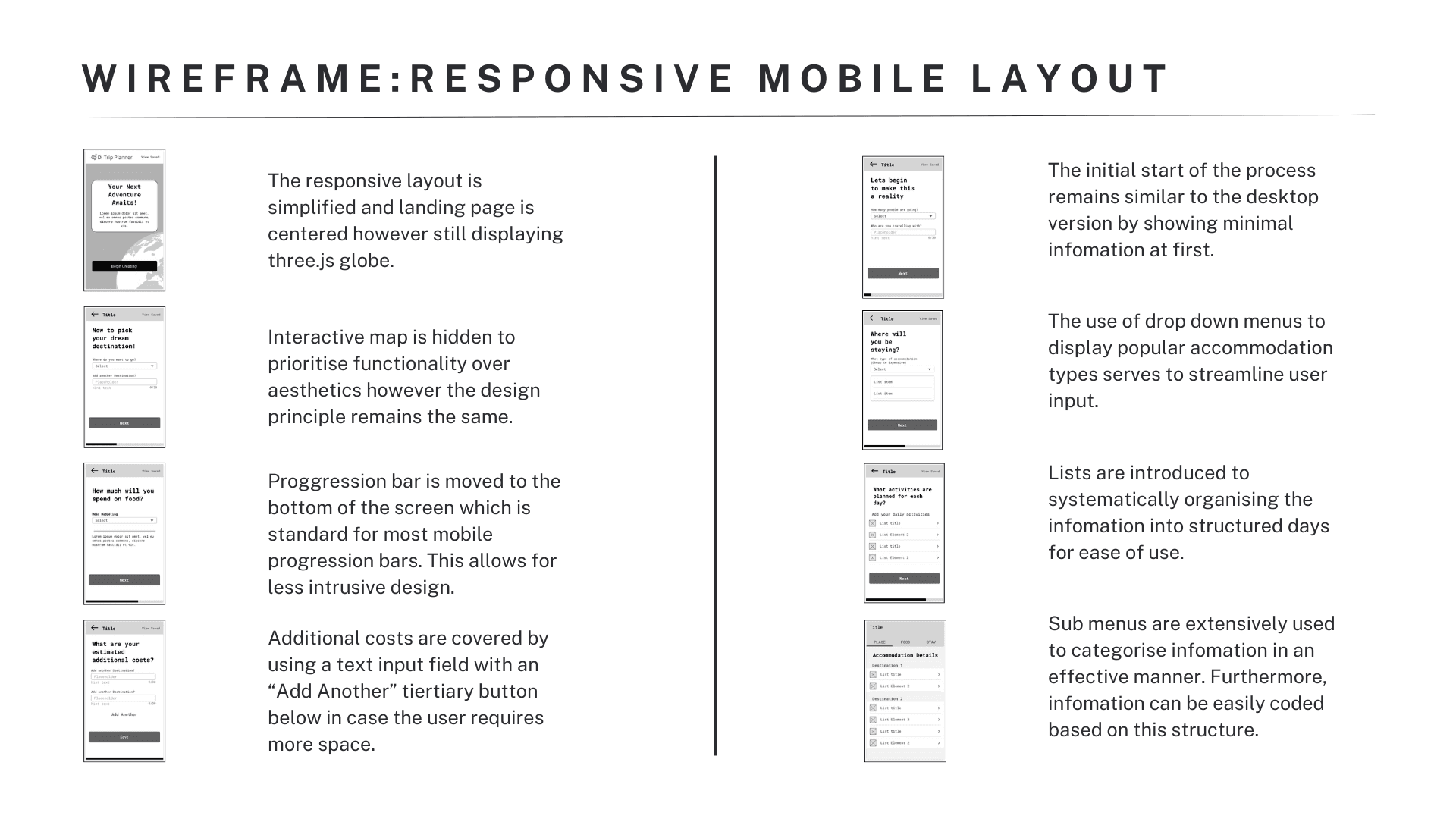
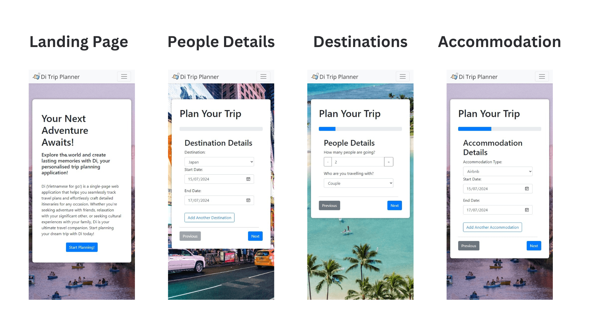
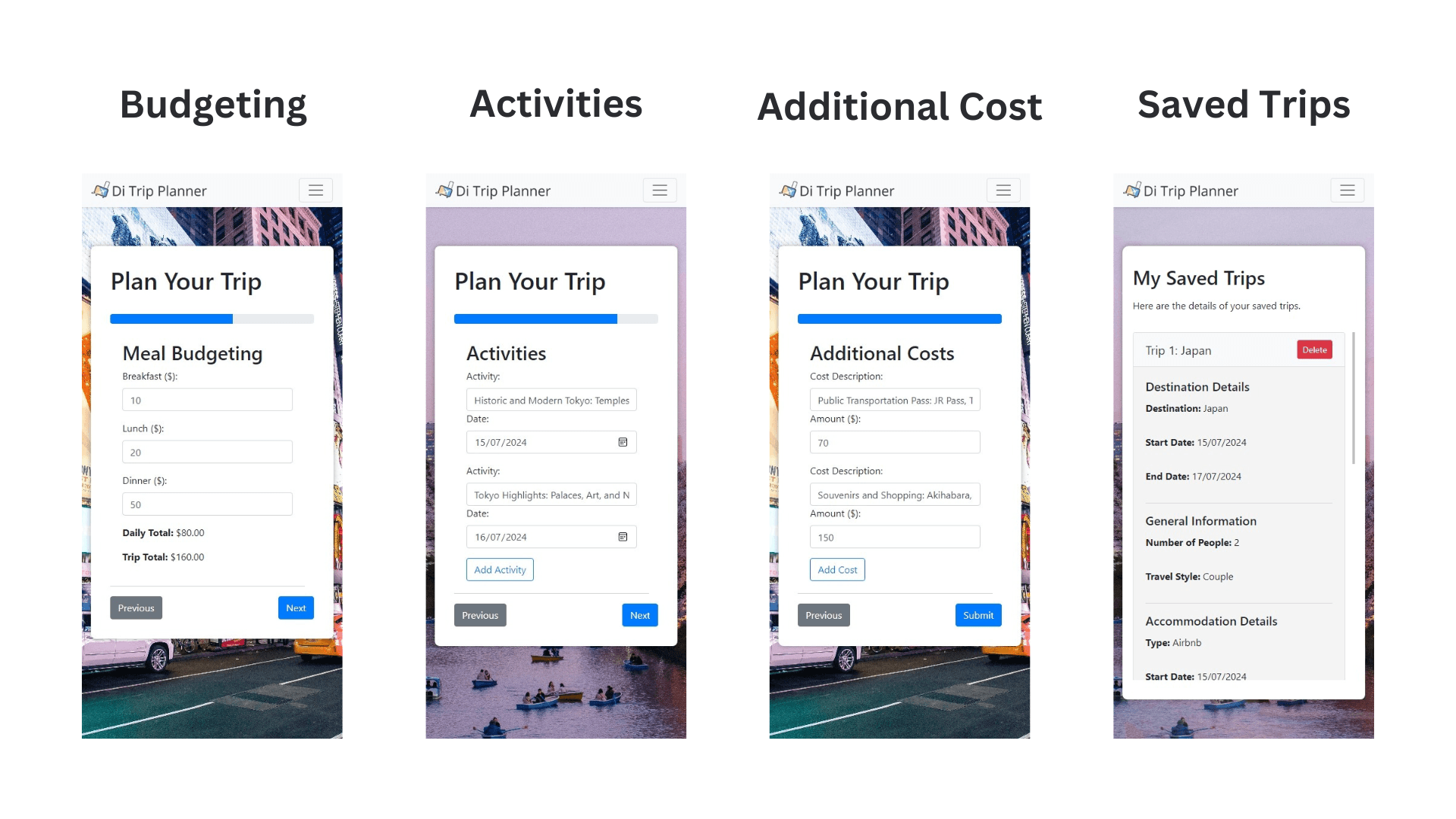
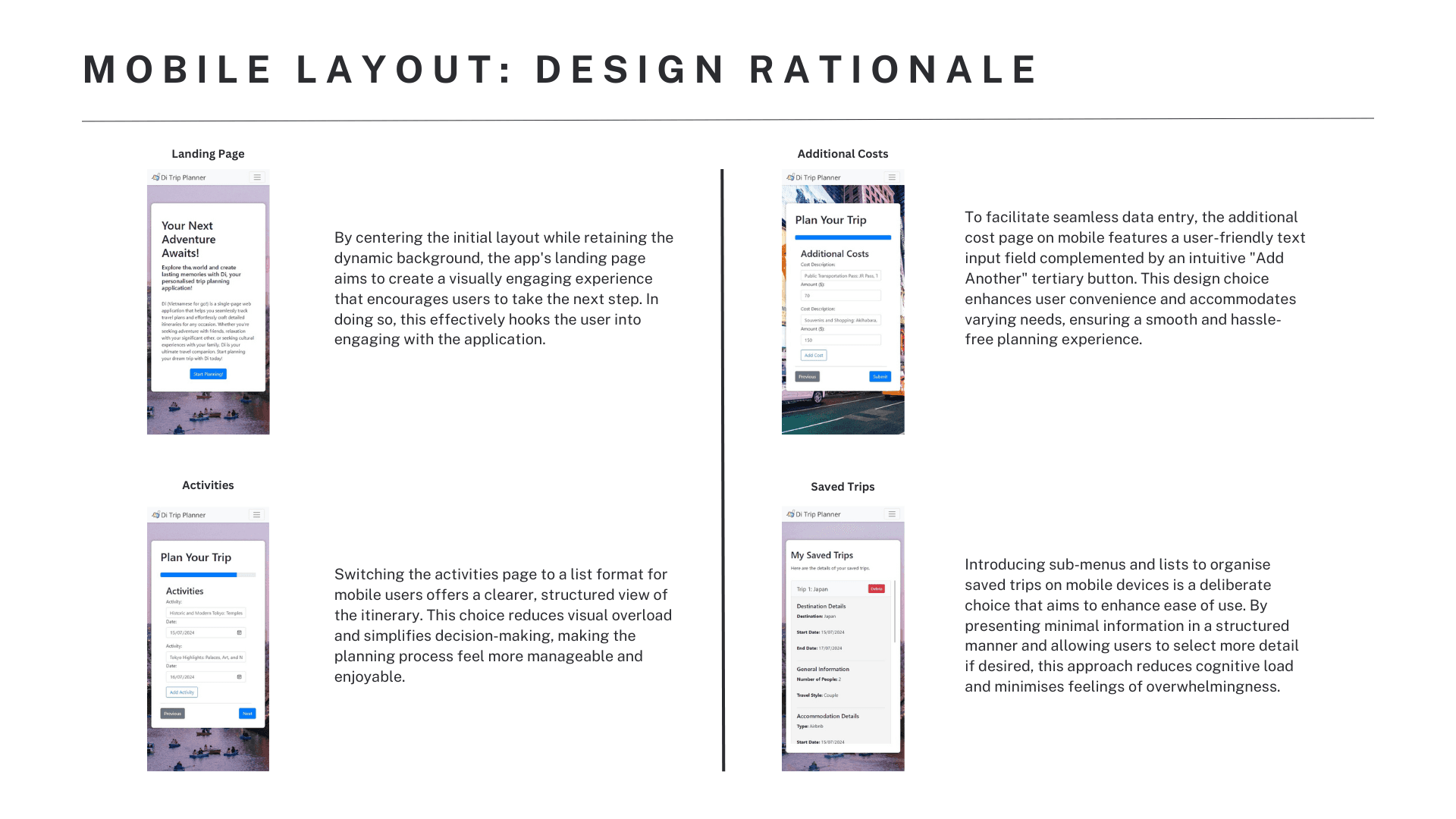
Here are some early wireframes of the web app, including all key sections and a styled form design. These wireframes allowed me to efficiently communicate my ideas with others to gain valuable feedback.
Detailed Mockups
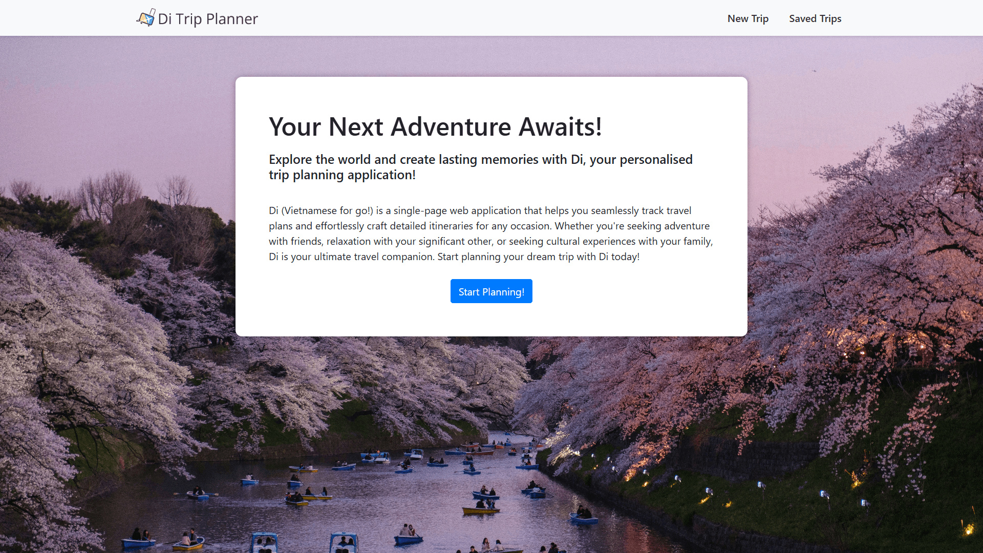
Here are some early wireframes of the web app, including all key sections and a styled form design. These wireframes allowed me to efficiently communicate my ideas with others to gain valuable feedback.
Logo: Navigating New Horizons
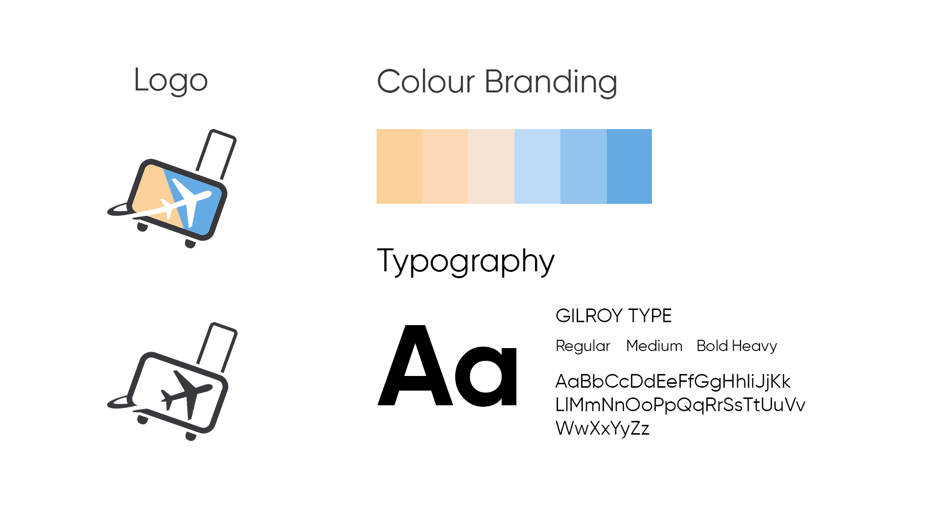
Icon and Symbolism: The logo prominently features a stylized suitcase with wheels, but upon closer inspection, you’ll notice that the center of the suitcase resembles a sleek airplane. This fusion of travel essentials—the suitcase and the plane—captures the essence of exploration and adventure. The airplane symbolizes the boundless possibilities that await travelers as they embark on their journeys.
Dynamic Composition: The arrangement of the logo elements creates a sense of movement. The suitcase-plane combination seems ready to take flight, inviting users to explore new horizons. Whether it’s a weekend getaway or an international expedition, ‘Di’ promises seamless planning and unforgettable experiences.
Colour Branding: Shades of Adventure
Blue Palette: Our carefully curated color branding revolves around a soothing palette of blues. Each shade serves a purpose:
Light Blue: Resembles clear skies, encouraging dreamers to envision their next destination.
Deeper Blues: Evoke the vastness of the sea, symbolizing uncharted waters and the thrill of discovery.
Soothing Effect: These harmonious blues create a calming backdrop for travel planning. They assure users that their journey with ‘Di’ will be stress-free, serene, and filled with wonder.
Typography: Clarity Meets Style
Font Choice: The portfolio embraces the “GILROY TYPE” font family. Its clean lines and modern aesthetic ensure readability across various platforms. Whether viewed on a mobile screen or printed material, the typography remains crisp and elegant.
Font Weights: We leverage different font weights strategically:
Regular: For essential information and body text.
Medium: Adds emphasis to subheadings and key details.
Bold and Heavy: Used sparingly for impactful statements and calls to action.
Alphabet Showcase: Explore the versatility of ‘GILROY TYPE’ through uppercase and lowercase letters. From A to Z, this font embodies clarity, sophistication, and a touch of wanderlust.
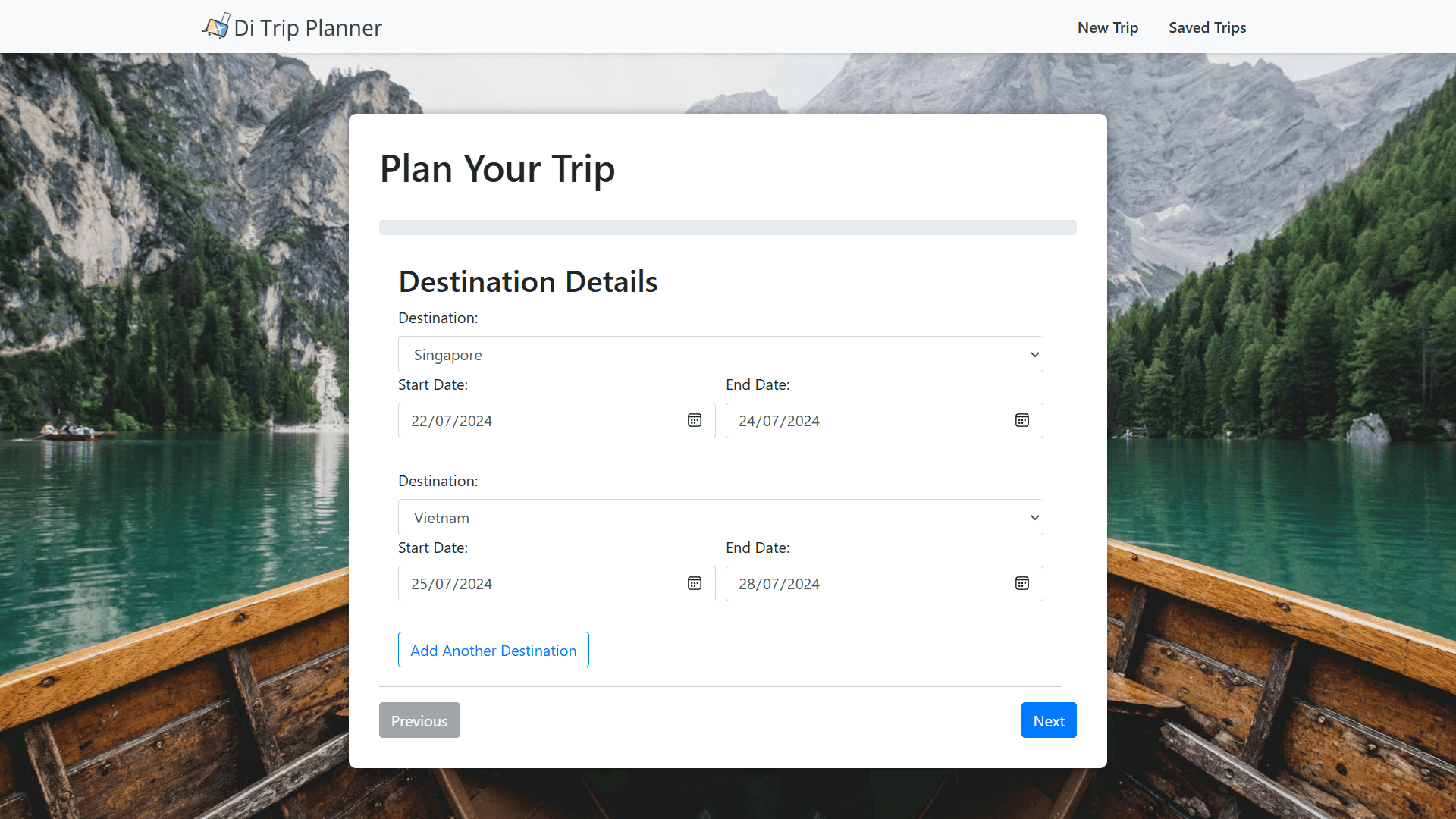
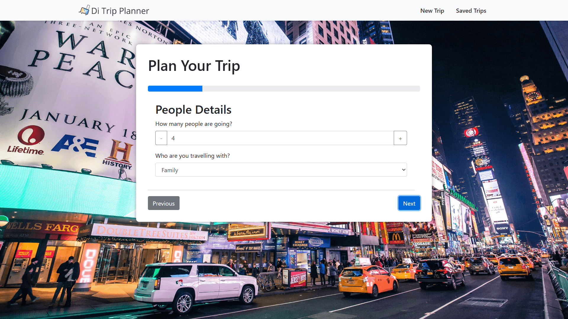
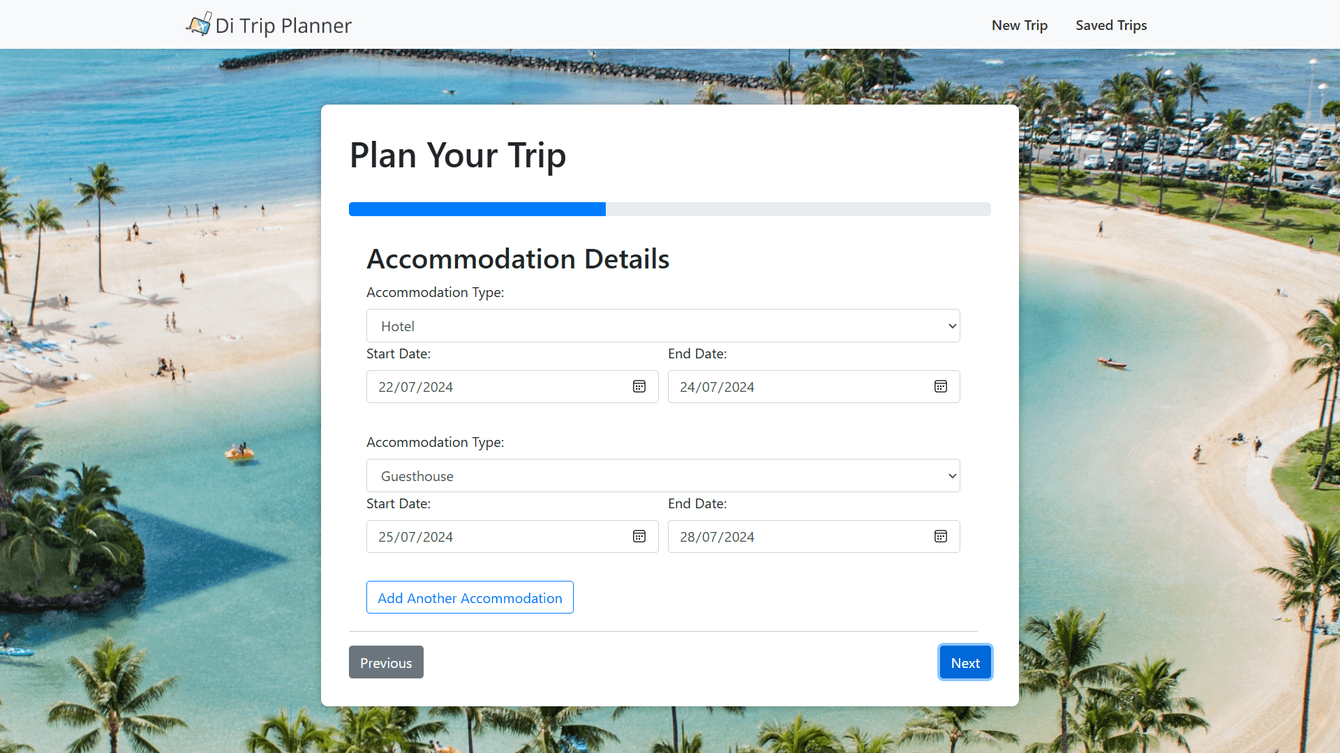
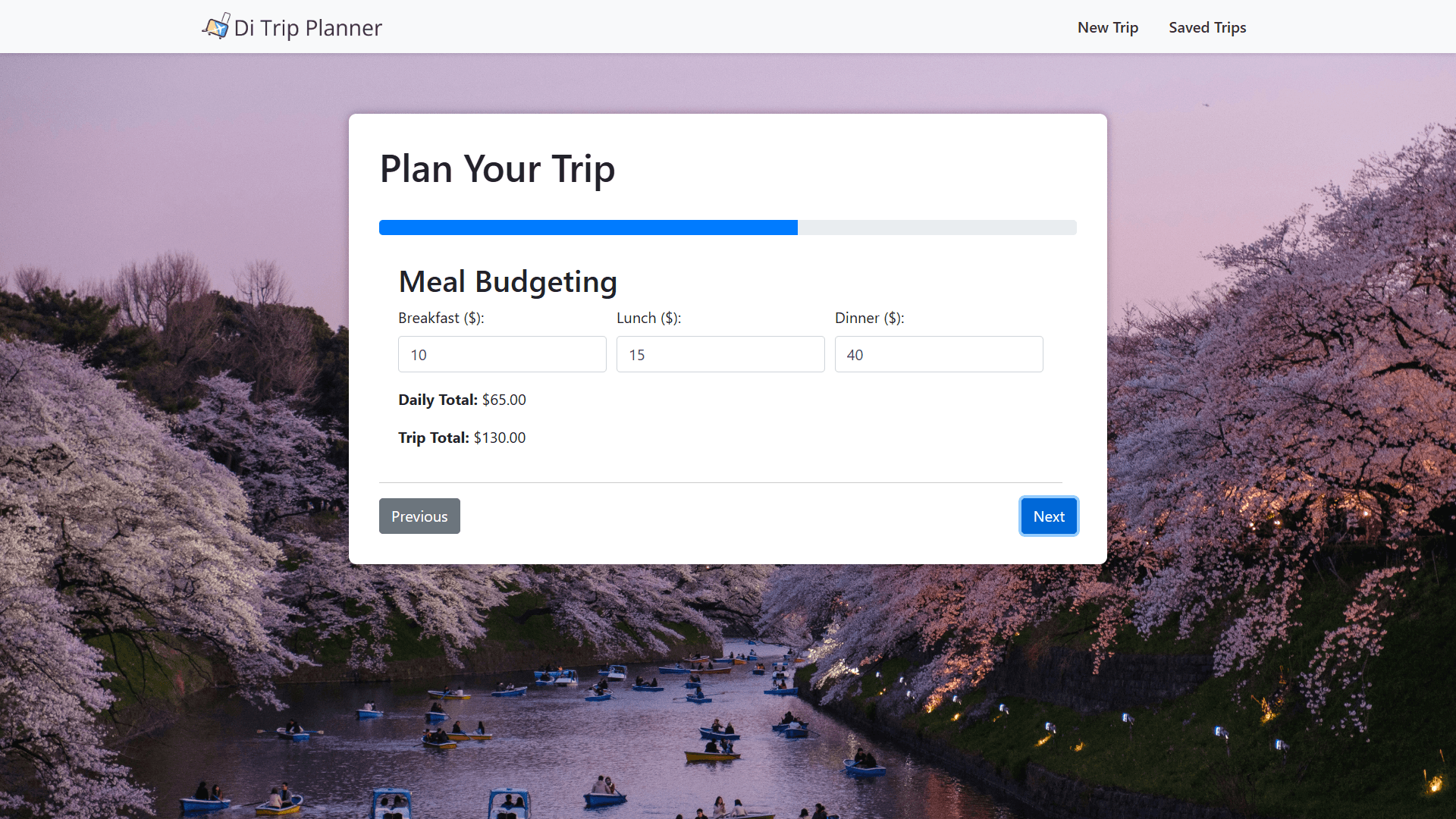
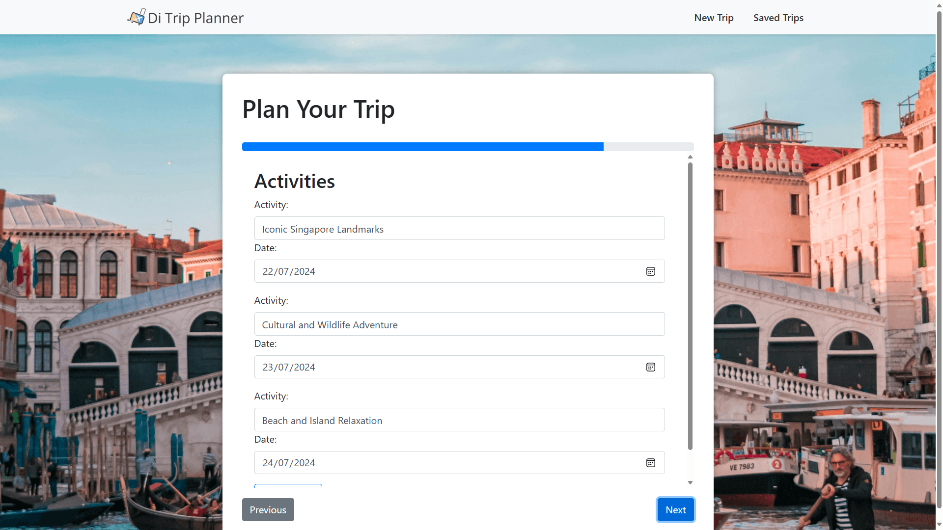
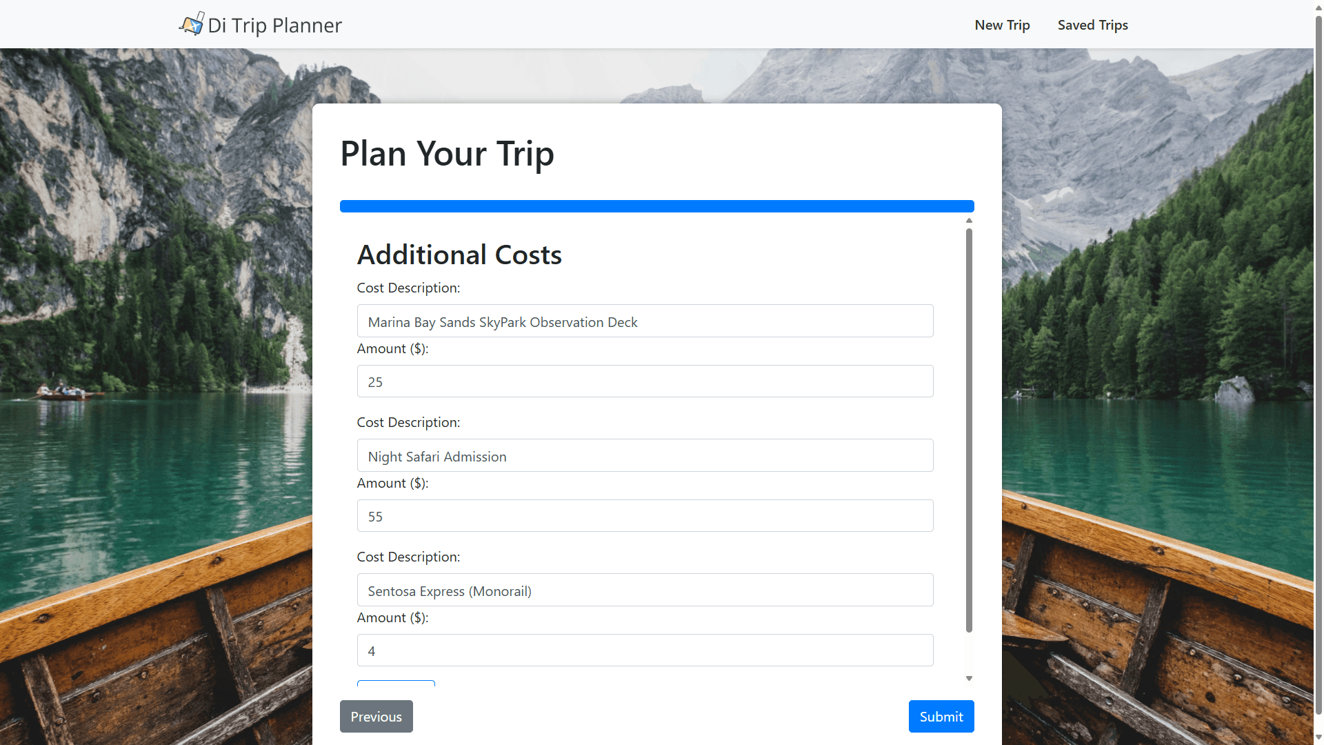
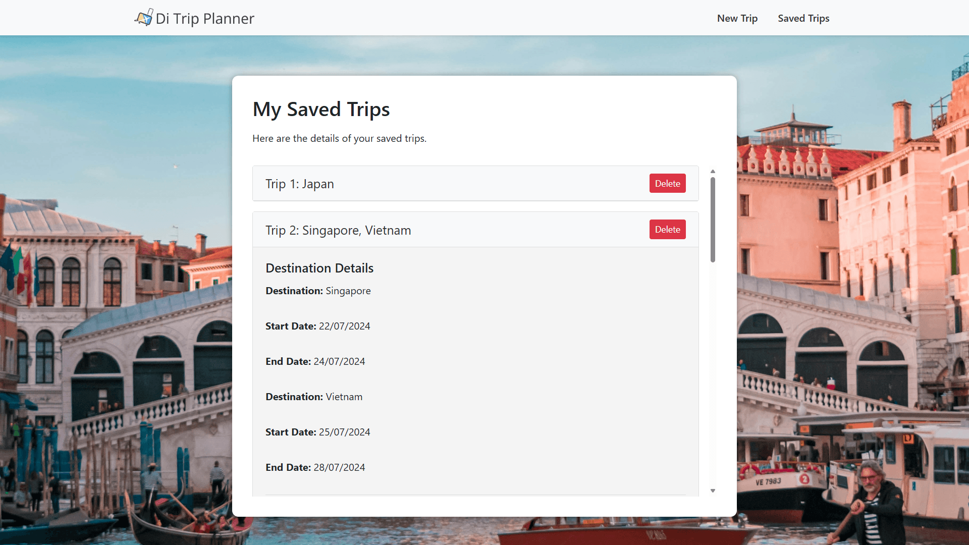
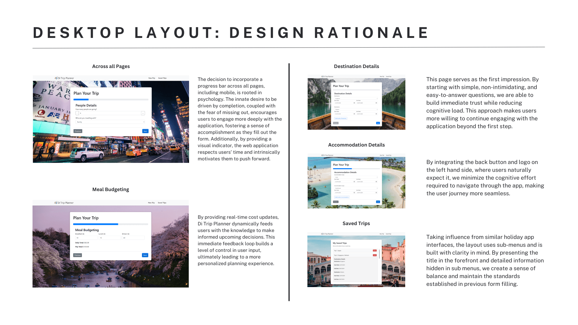
Final Website
Final Website:
You can access the GitHub page for my application here: GitHub Repository. Feel free to download the application following the provided instructions.
Design Process: DTMBR (Design → Think → Make → Break → Repeat)
Think:
Background Research: Conducted desktop research, brainstorming sessions, and selected the target audience.
Information Architecture: Designed the user flow and data model.
Make:
Low-Fidelity Prototyping: Created sketches and wireframes.
Break/Repeat:
Iteration: Performed user testing and self-reflection to refine the design.
Develop:
High-Fidelity Mockup: Produced detailed visual designs.
Final Product: Developed the application through coding.
Key Takeaways
During this project, I was able to successfully integrate my diverse coding skills, combining HTML5, JavaScript, Node.js, SCSS, CSS, React, and other bundlers to create a cohesive product. It was a valuable experience that allowed me to see how different technologies can work together seamlessly in a single web app, improving both functionality and user experience.
Next Steps
The next steps for this project involve uploading the page to a live server, potentially using GitHub Pages, so it can be accessed by everyone. Additionally, I'll be integrating a feedback section to gather user insights, which will be crucial for further refining and enhancing the app.
